Naujienos
BC Lietkabelis Panevezys introduces new team logo
2016 08 05Lietkabelis Panevezys took another step in their growing organization by introducing new team logo.
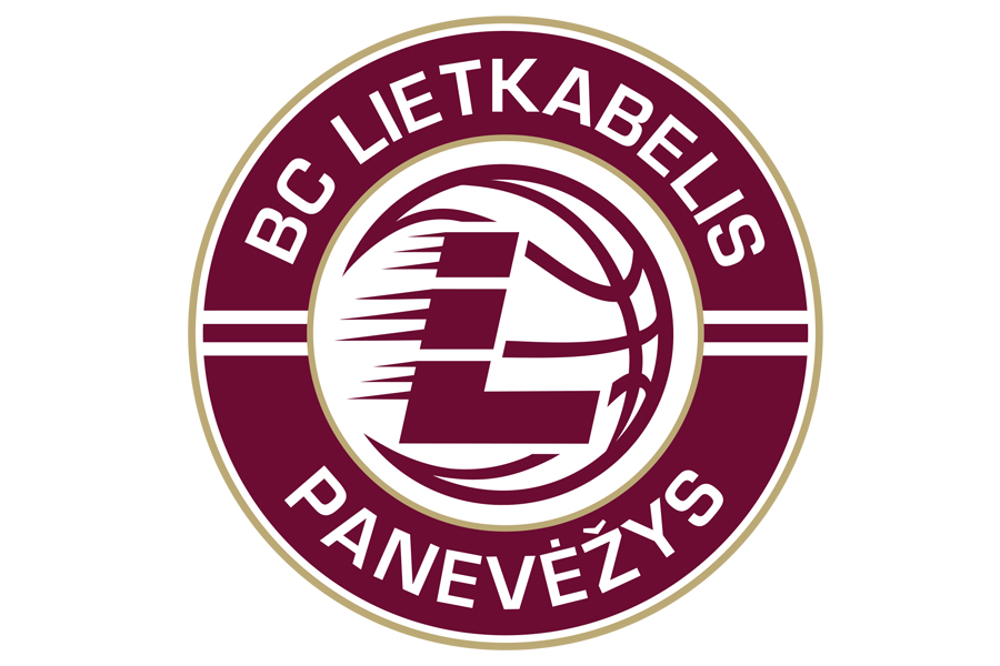
New primary logo, a circular shield with a ball shaped as claw with energetic L letter which represents the historical name of the Club.
Club was named Lietkabelis in 1964 the same as one the biggest factories in Lithuanian which is successesfully running its business till this day.
The logo will feature the team’s primary colours of burgundy, white and gold.
„The re-branding of team logo is a natural evolution process of any sports organisation. For us it represents a new era, after all, Lietkabelis will compete in international basketball club competition after 16 years long brake. Due to that, we could not choose a better timing of introducing our new logo.
We are also happy to present an alternative team logo. This is a new thing in Lithuanian basketball which will help us a lot working with future marketing projects“, – Marketing Director of Lietkabelis Panevezys said.